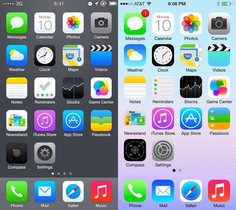
Apple keeps on rolling out different versions for its operating system. One of the best things about these iOS versions is that each one comes with a unique design to render flawless user experiences. Talking specifically about the seventh version of iOS, it can well be said that Apple product users have been quite perplexed about the new styling and features. With a majority of iOS app designers and developers feeling the need for adjusting their programming language to match iOS 7's “flat” design, there have been continuous discussions as to whether iOS 7 design has been created using Microsoft Word or a different web designing tool. Through this blog, I'll be digging deep into the reality behind this confusion.
Apple bids adieu to 'Rounded Corners' with iOS 7
Unlike the previous versions of iOS, the seventh version doesn't comprise of rounded corners with simple radii values. Thanks to the efforts put in by the developers associated with each iPhone app development company, we now have a new shape for the operating system, called “Superellipse”. You can gather a better understanding of the App Icon Template for designing apps that target devices running on iOS7. This brand new shape rendered to the operating system works as an excellent option for adding special effects such as shadows, strokes etc. in the applications.
Simplicity - A reason why iOS 7 might have not been designed in Microsoft Word
iOS app designers have always focused on creating an organic experience for the end users. Paying due heed to this concern of designers, Apple; the creator of iOS has ensured to use a design tool that is equipped with numerous capabilities. As compared to a lot of other design software tools, Microsoft Word is backed by a limited potential for enabling designers to come up with an out-of-the-box iOS application.
iOS 7's ugly user interface- Is it a result of using Microsoft Word?
Although iOS 7 might be running tons and tons of Apple-supported mobile devices, a majority of UX critiques have pointed out visible user-experience flaws. There are have been reports about the inappropriate use of font sizes and margins in apps that are being designed for iOS7. App UX analysts believe that these UI flaws could be the result of using a mediocre design tool like Microsoft Word. Also, there have been discussions about the ill-effects of the gesture-focused design approach that has been used in iOS 7. Although gestures are fun to use, there have been numerous animated movements that have been the sole factor behind the dis-orientation that prevails in iOS 7's design. Moreover, while the diagonal zooming in and out of content makes iOS 7 look sleek, there are times when the same effect make the operating system look dumb.
Content appearance has been modified for iOS 7 apps
Despite keeping the size of status bar similar to the one used in iOS 6, Apple has made visible changes in the way content is displayed within the status bar of iOS 7 applications. Now, designers are rendered an amazing flexibility of controlling the background color to match the overall look and feel of their apps. They are also free to use default color schemes for designing eye-catchy iOS 7 apps.
iOS 7's less intuitive nature has been bothering iOS app designers
With almost every iOS app developer looking out for greater intuitiveness in the iOS version, iOS 7 definitely seems to disappoint. With a high count of missing features, iOS 7 is tedious to work with. For example, closing a new web page in Safari took a lot less time in previous iOS versions as compared to iOS 7. And that's not all. The new styling introduced in the keyboard has lead to emergence of some hard-to-tackle challenges for the app designers. With complexity attached to capitalization of words, it becomes tedious for designers to incorporate the desired functionality into the applications.
Wrapping it all up
With all the benefits and hassles associated with the iOS 7 design, it is hard to determine the exact web design tool that was being utilized for designing the operating system. If there is something else that is bugging you about Ios 7 design then please don't hesitate in sharing its details using the comments box provided right under this post. I'd be waiting for your feedback/comments/suggestions on my blog.
Author Bio
Rick Brown is a veteran iPhone programmer for Mobiers Ltd., - a renowned iPhone App Development Company. In case you are willing to avail more information about related technology and development platform, feel free to contact him.
